CLIENT
EY+
DATE OF RELEASE
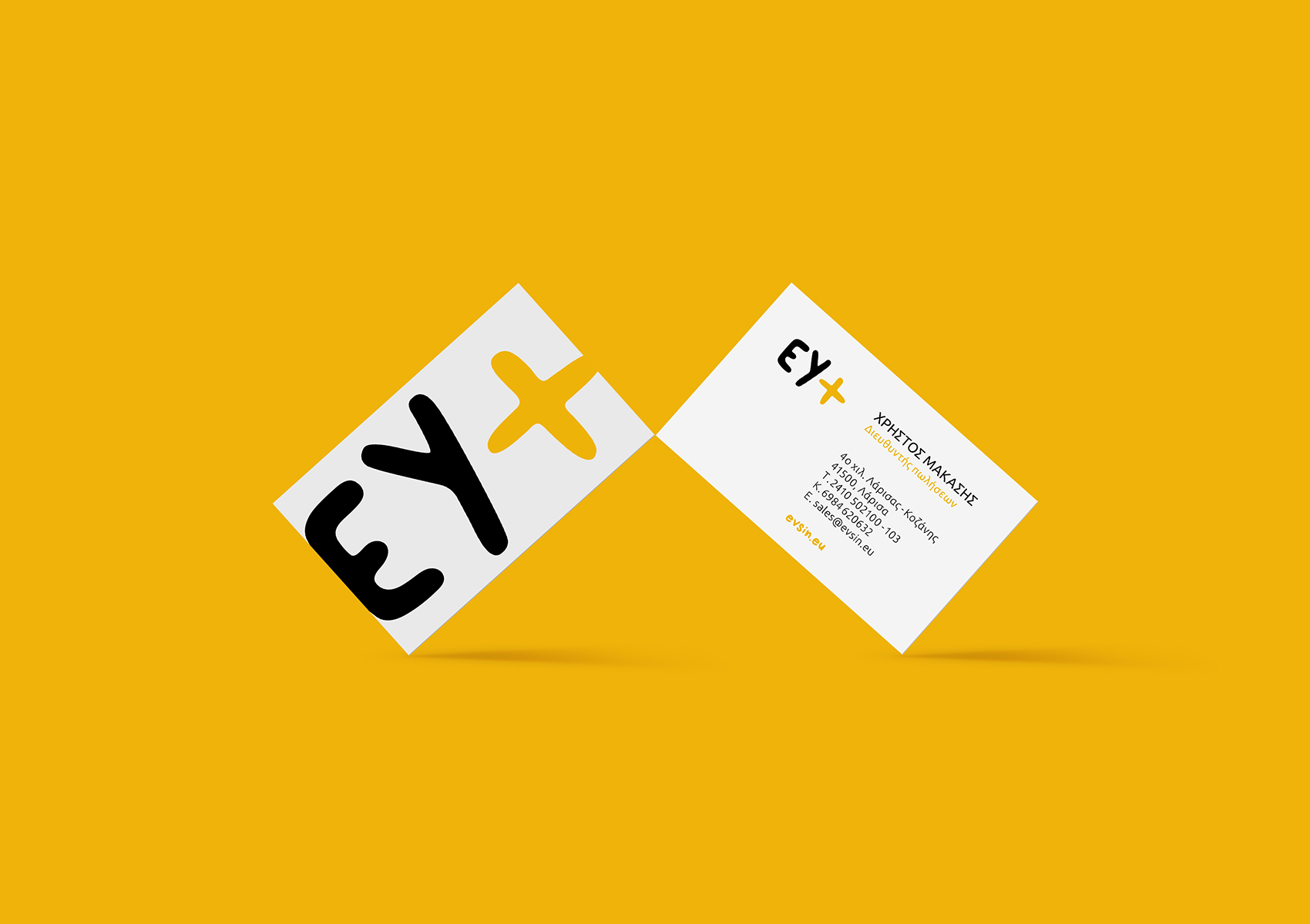
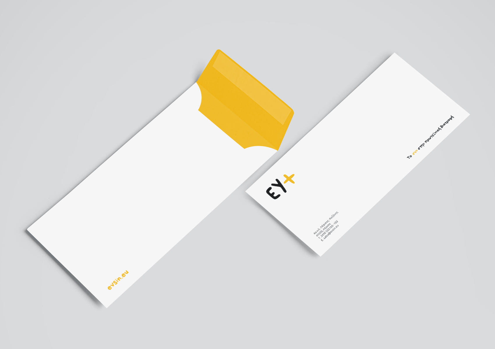
2020EY+ is a new venture in the field of nutrition. The innovative company supplies large supermarket chains daily with high protein meals. I was asked by the company to create the visual identity of the brand, emphasizing the protein value of it's products. The name of the company is a paraphrase of the ancient greek "Ευ Ζην (Ev Zin)". "Ev Zin" refers to the way of life that aims to improve the quality of life in any perspective. The + (plus) symbol, refers to the "plus" extra protein that all of the meals contain. The light orange color of the logotype is inspired by the primary color of high protein foods like egg yolks and oranges. In every package prevails the white color, leaving space for the product itself to stand out.

Select your language
